

Do you want to increase positive sentiment![]() Overall mood or result of the interaction as determined by analysis of words, phrases, and context of the transcript. during interactions
Overall mood or result of the interaction as determined by analysis of words, phrases, and context of the transcript. during interactions![]() The full conversation with an agent through a channel. For example, an interaction can be a voice call, email, chat, or social media conversation.? Follow this success guide to design a workspace
The full conversation with an agent through a channel. For example, an interaction can be a voice call, email, chat, or social media conversation.? Follow this success guide to design a workspace![]() Named view of one or more widgets. focused on agent or client sentiment. Improving sentiment can benefit your organization in the following ways:
Named view of one or more widgets. focused on agent or client sentiment. Improving sentiment can benefit your organization in the following ways:
- How agent behavior impacts customer sentiment.
- How clients feel about products, policies, procedures, and so on.
- How to improve customer satisfaction and agent training.
Interested in a more visual approach? Watch this short training on customizing a workspace for sentiment.
Classics, Inc. wants to identify gaps in agent training that may impact sentiment. They want to compare the performance of two teams with similar skills from different locations. The Kansas team is a new team made up of newer agents. The Emerald City team has existed longer and has more experienced agents. They are interested in discovering:
- If the two teams share common agent behaviors and issues.
- If there are things that one team is doing that could help the other.
- How they can use what they discover to enhance agent training.
- If changes to agent training impact sentiment.
Set Up a Sentiment Workspace
These instructions are a recommendation for how to build a workspace![]() Named view of one or more widgets.. They're meant to help you get started. You can customize workspaces in many other ways to suit your organization's needs. You can configure a dataset workspace using other widgets
Named view of one or more widgets.. They're meant to help you get started. You can customize workspaces in many other ways to suit your organization's needs. You can configure a dataset workspace using other widgets![]() Graphical representation of data that meets specified filter criteria., metrics
Graphical representation of data that meets specified filter criteria., metrics![]() Statistics you can measure to keep track of your contact center., and filters not mentioned here.
Statistics you can measure to keep track of your contact center., and filters not mentioned here.
Create the Workspace
- Go to My Data and open the dataset you want to analyze.
- Click the workspace panel
 if it is not already open, then click Add Workspace.
 - Click the Widget Drawer
 .
. - Select these widgets to add them to your workspace:
Overview Bar, under the Volume section. Select this widget a second time, so that two appear in your workspace.
Top Categories, under the Volume section.
Silence Percentage, under the Volume section.
Sentiment Trend, in the Sentiment section. Select this widget a second time, so that two appear in your workspace.
Frustration Trend, in the Frustration section.
Top Company Profile Terms, under the Volume section.
Metrics, under the Volume section. Select this widget a second time, so that two appear in your workspace.
Some of these widgets require more configuration after you add them to the workspace. This is so you can view specific data related to sentiment. Other widgets use the default settings.
- You can edit any of the widgets to adjust their size or position.
Configure Overview Bar Widgets
Configure one Overview Bar widget for client sentiment (the default) and the other for agent sentiment.
- Click more options
 > Settings in the top right corner of the widget. Change the widget Title to Client Overview. That's it for configuring the client sentiment widget.
 -
To configure the agent widget, click more options
> Settings. Change the widget Title to Agent Overview. -
Click the Widget Options drop-down and for Participant, select Agent.
-
Clear the checkbox for Display Interactions. The client Overview Bar widget already displays this information.
-
Click OK.
Configure Sentiment Trend Widgets
Configure one Sentiment Trend widget for client sentiment (the default) and the other for agent sentiment.
- Click more options > Settings in the top right corner of the widget. Change the widget Title to Client Sentiment Trend. That's it for configuring the client sentiment widget.
- To configure the agent widget, click more options > Settings. Change the widget Title to Agent Sentiment Trend.
-
Click the Widget Options drop-down and for Participant, select Agent.
- Click OK.
Configure Metrics Widgets
Configure one Metrics widget to display the top performing teams and the other for top performing skills.
Depending on your needs, Agent Name may be a more useful metric. You can use the Agent Name metric in place of either Team Name or Skill Name.
- Click more options > Settings in the top right corner of the first Metrics widget.
- Click the Widget Options drop-down and for Field, select the Team Name.
- For Number to Show, enter a number from 1–25, the number of teams you want the widget to display data for. The default is 10.
- You can customize the bar color or order in which the bars display in the widget.
- You can give the widget a new Title, such as Top Teams.
- Click OK.
- Repeat these steps for the second Metrics widget but for Field, select Skill Name. You can make the same customizations and give the widget a new Title, such as Skills.
Filter Workspace by Sentiment
You can filter your workspace![]() Named view of one or more widgets. by different sentiment
Named view of one or more widgets. by different sentiment![]() Overall mood or result of the interaction as determined by analysis of words, phrases, and context of the transcript. types. You can also analyze overall sentiment, beginning sentiment, or end sentiment. Filter by each sentiment type to establish a baseline for interactions in your dataset
Overall mood or result of the interaction as determined by analysis of words, phrases, and context of the transcript. types. You can also analyze overall sentiment, beginning sentiment, or end sentiment. Filter by each sentiment type to establish a baseline for interactions in your dataset![]() Set of parsed interaction transcripts that spans a specific period of time and match your specified filter criteria..
Set of parsed interaction transcripts that spans a specific period of time and match your specified filter criteria..
-
Click
 in the top right corner of your workspace.
 -
Click Add Filters.
-
Expand the Sentiment drop-down and click the sentiment you want to view: Positive, Negative, Neutral, or Mixed.
-
Define when the sentiment must have happened in the interaction. Choose from one or a combination of:
- Overall Sentiment: The sentiment for the whole interaction.
-
Beginning Sentiment:
-
End Sentiment:
The widgets in the workspace update to only display data for the sentiment filters you selected.
How to Use a Sentiment Workspace
Start by developing a theory about sentiment![]() Overall mood or result of the interaction as determined by analysis of words, phrases, and context of the transcript.. Consider agents, teams, and topics you think may have strong positive or negative sentiment. Each widget displays details to help you test your theory. Compare widgets side by side to see specific issues. Your observations help you determine what filters can identify areas for improvement. The widget data that displays in the workspace
Overall mood or result of the interaction as determined by analysis of words, phrases, and context of the transcript.. Consider agents, teams, and topics you think may have strong positive or negative sentiment. Each widget displays details to help you test your theory. Compare widgets side by side to see specific issues. Your observations help you determine what filters can identify areas for improvement. The widget data that displays in the workspace![]() Named view of one or more widgets. depends on the dataset parameters set for the dataset.
Named view of one or more widgets. depends on the dataset parameters set for the dataset.
Choose one sentiment type to investigate first. Then filter by a different sentiment type to compare data and find areas where you can work on improving sentiment.
Classics, Inc. uses a sentiment workspace to achieve their goals to discover:
- If the two teams share common agent behaviors and issues.
- If there are things that one team is doing that could help the other.
- How they can use what they discover to enhance agent training.
After establishing a sentiment baseline, they filter their workspace for positive sentiment. They observe how that impacts the widget data. Then they explore what categories and company profile terms are used most often. They use the Metrics widgets to compare the Kansas and Emerald City teams. They look at which agents have the highest positive sentiment to see what they are doing well.
Then they filter the workspace for negative sentiment. They observe the impacts, looking at categories and company profile terms to identify issues. They look at agents with the highest negative sentiment to identify trainings gaps. And they compare the two teams in the metrics widget.
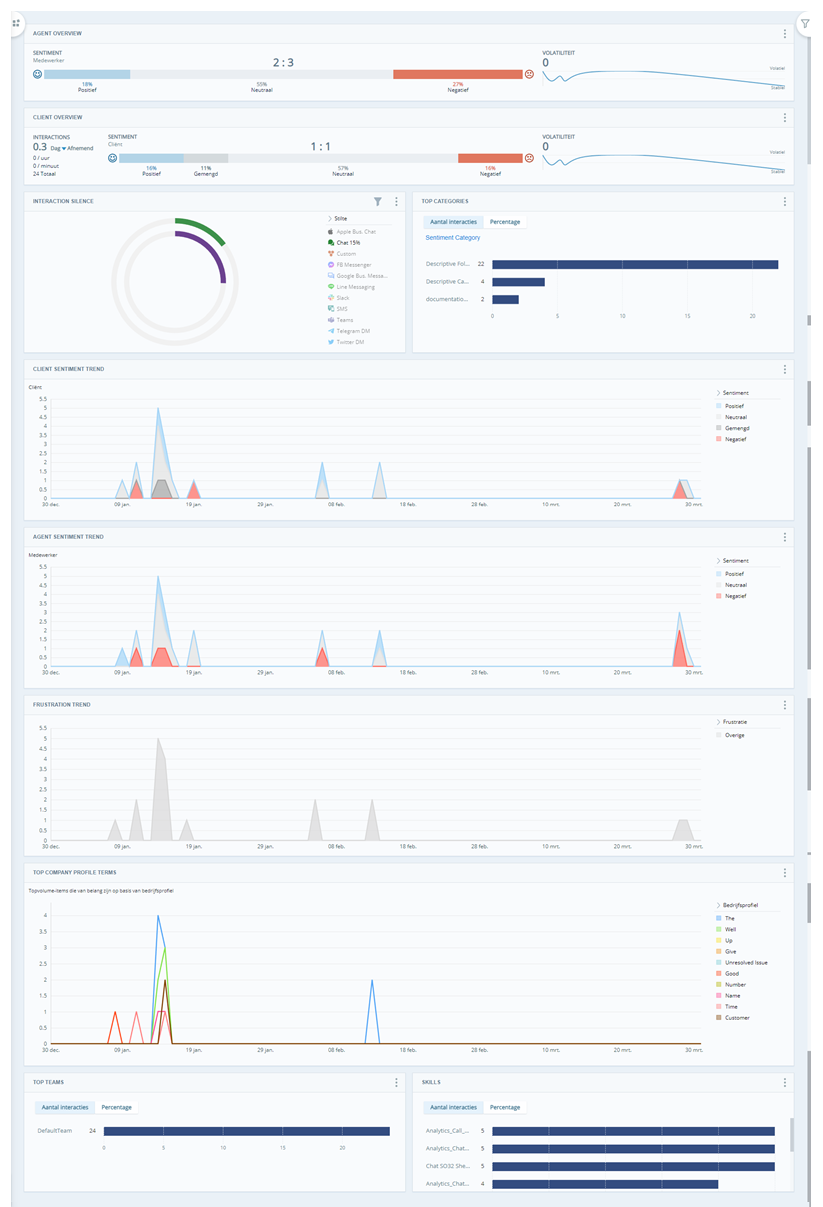
Overview Bar Widget
The Overview Bar widget displays big picture information about the data in the dataset![]() Set of parsed interaction transcripts that spans a specific period of time and match your specified filter criteria.. You can include one or more of these three sections in the widget:
Set of parsed interaction transcripts that spans a specific period of time and match your specified filter criteria.. You can include one or more of these three sections in the widget:
- Interactions: Number of interactions per minute, per hour, per day, and total in the dataset. Also shows increasing or decreasing trends in the number of interactions.
- Sentiment: Percentage of total interactions per sentiment
 Overall mood or result of the interaction as determined by analysis of words, phrases, and context of the transcript.. You can choose whether to show contact sentiment or agent sentiment.
 - Volatility: How sentiment is trending over the time period in the dataset. Different interactions can display different sentiments. Sometimes sentiment swings occur within individual interactions themselves. This line chart helps you see how sentiment is trending throughout the entire dataset and time period being analyzed. The line trends upward when the data is considered volatile, that is, when there is an increasing amount of rapid change in sentiment. It trends lower when the data is more stable, or when there are fewer changes in sentiment.
Having these widgets at the top gives a general idea of how sentiment is trending throughout all interactions in the dataset.
Top Categories Widget
The Top Categories widget lets you see what categories![]() Data groups that Interaction Analytics (CXone) uses for parsed call transcript data. They make it easier to find trends. are most common. This is most helpful if you have categories organized by specific topics. View the Interaction Reason success guide for help creating custom categories.
Data groups that Interaction Analytics (CXone) uses for parsed call transcript data. They make it easier to find trends. are most common. This is most helpful if you have categories organized by specific topics. View the Interaction Reason success guide for help creating custom categories.
Filter the widget to see which categories have the highest negative sentiment. This can help you identify interaction reasons to address.
Classics wants to know which department has the most negative interactions. They create a category folder called Department. Then they create subcategories for Sales, Billing, and Customer Service. They filter the Top Categories widget by negative sentiment and see that the Customer Service category has the most interactions with negative sentiment. They review individual transcripts and recording to find out why.
Interaction Silence Widget
The Silence Percentage widget helps you identify interactions containing notable silence. In Interaction Analytics (CXone), silence is considered notable if it lasts three or more seconds. The widget shows the notable silence percentage for each channel. Total notable silence for an interaction is the sum of all notable silence periods.
Chats interactions tend to have a higher silence percentage than voice interactions. That's because there can be varying times between responses.
Silence in interactions often correlates with sentiment. Filter the workspace by each sentiment type to see how the silence percentage is effected. For example, your baseline might show that positive sentiment correlates with a smaller silence percentage. You could then develop a plan to reduce silence time to increase positive sentiment.
Sentiment Trend and Frustration Trend Widgets
View these two widgets together. Sometimes, negative sentiment![]() Overall mood or result of the interaction as determined by analysis of words, phrases, and context of the transcript. and frustration
Overall mood or result of the interaction as determined by analysis of words, phrases, and context of the transcript. and frustration![]() Different from negative sentiment. Frustration cues show that a customer is upset rather than just discussing something negative. don't mean the same thing. However, spikes in both negative sentiment and frustration usually indicate an issue. Frustration is only measured for the client, so you may want to put the Frustration Trend widget next to the Client Sentiment Trend widget. This makes it easier to see where negative client sentiment and frustration overlap. However, if you're interested in seeing how agents handled frustrated customers, place the Frustration Trend widget next to the Agent Sentiment Trend widget. Periods where negative feelings and frustration are high in all three widgets are good places to investigate.
Different from negative sentiment. Frustration cues show that a customer is upset rather than just discussing something negative. don't mean the same thing. However, spikes in both negative sentiment and frustration usually indicate an issue. Frustration is only measured for the client, so you may want to put the Frustration Trend widget next to the Client Sentiment Trend widget. This makes it easier to see where negative client sentiment and frustration overlap. However, if you're interested in seeing how agents handled frustrated customers, place the Frustration Trend widget next to the Agent Sentiment Trend widget. Periods where negative feelings and frustration are high in all three widgets are good places to investigate.
If you see a spike in sentiment or frustration, you can select a different Date Range in the workspace filters. Focusing on interactions in a more specific date range can help you know what company profile terms and metrics to filter for. This can help you identify specific causes of negative sentiment.
A data analyst at Classics, Inc. notices an increase in negative sentiment and frustration during the same couple of weeks. They adjust the Date Range to a Custom range for when the increase occurred. Then, they look at the Top Categories and Top Company Profile Terms widgets to find out why customers are contacting Classics. The data analyst discovers that customers keep mentioning the same new product. This data prompted Classics to take a closer look at the product and the training agents received for it. This revealed a gap in the knowledge that agents need to resolve interactions effectively. The lack of knowledge surrounding the new product caused customer annoyance. It also caused an increase in negative sentiment in related interactions.
Spikes and dips in sentiment aren't always common. These widgets can also help you monitor gradual trend changes and track the progress of your organizational goals.
Top Company Profile Terms Widget
This widget shows you the company profile terms mentioned most often. This can help you identify topics that clients typically complain about or are pleased with. To hide irrelevant terms, click the term and then Hide. To take a closer look at individual interactions where certain words appear, click the term and then Show Interactions.
Metrics Widgets
The Metrics Widget shows which teams, agents, or skills rank highest for each sentiment type. You can evaluate who is doing well and who may require further coaching. You can click more options > Settings in the widget to edit the display. You can also click any of the bars in the widget and then click Show Interactions to see more details.
Measure and Track Progress
A goal-focused workspace is most valuable when your insights are used to drive change. Be sure to measure and track your progress on a regular basis. This helps you see how you are improving and helps you set appropriate goals.
A Classics, Inc. analyst used this sentiment workspace to compare these teams. She discovered that the Emerald City team interactions averaged 20% higher sentiment than the Kansas team. She filtered the workspace to show only positive interactions to find out why. Viewing individual interaction recordings and transcripts helped identify several ways to improve training. They discovered that:
- The Emerald City team is knowledgeable about products and consistent with behavioral policies.
-
Since the Kansas team is new, they behave differently in a few ways:
- Inconsistent greetings.
- Higher silence time percentages.
- Lack confidence in product knowledge.
In response to what they found, Classics, Inc. enhanced training on products and customer courtesy for the Kansas team.
A month later, Classics ran the Analytics Metric Statistics report. It showed that the Kansas team improved their positive sentiment by 7%. Classics continues to run the Analytics Metric Statistics report on a regular basis. They want to monitor progress until the Kansas team’s sentiment reaches or exceeds the Emerald City team.
Run the Analytics reports to view your progress. You could view data on a monthly basis or after a coaching session to track progress.
When you review report data, consider the effects of timing. Look for patterns that may occur on the same day of the week or time of year. For example, negative sentiment may be higher on weekends if wait times are higher. So, you might address that issue by having more agents available on weekends. Or positive sentiment may be higher after agents experience quarterly performance reviews. So, you may want to begin having evaluations or trainings more often to keep agents motivated and informed.
Your workspace will be most effective when you tie insights to business goals and strategies. It's also important to share insights with the people who have power to make change happen.