

Do you want to know why interactions![]() The full conversation with an agent through a channel. For example, an interaction can be a voice call, email, chat, or social media conversation. happen? Why customers reach out to you? What they talk about? Follow this success guide to design a workspace focused on discovering the reasons driving interactions. Identifying interaction reasons can benefit your organization in these ways:
The full conversation with an agent through a channel. For example, an interaction can be a voice call, email, chat, or social media conversation. happen? Why customers reach out to you? What they talk about? Follow this success guide to design a workspace focused on discovering the reasons driving interactions. Identifying interaction reasons can benefit your organization in these ways:
-
Improved customer experience: You can see what causes negative customer sentiment and dedicate your improvement efforts accordingly.
-
Improved agent experience: You can identify what agents are struggling with. This helps you improve the resources available to agents, enhance training, and find areas where you can improve business procedures and processes.
-
Reduced escalations: You can identify what agents and customers struggle with. This helps you resolve those issues and limit future escalations. Understanding the reasons behind interactions empowers you to fix specific business processes.
-
Improve efficiency: You can see which reasons cause the longest interactions. This helps you know which processes you should prioritize improving. Addressing issues that take longer to handle frees up more time for agents to handle contacts.
Classics, Inc. wants to identify the most common reasons customers reach out to them. They hope that understanding these reasons will help them improve processes and the customer experience. They are interested in discovering:
- Reasons behind customer escalations.
- Reasons that lead to customer loss.
- Where there are self-service opportunities.
- What reasons cause longer interaction times.
- Why customers request to speak with agents' supervisors.
- Ways to improve agent resources and reduce the learning curve for trainees.
Configure Categories
Categories![]() Data groups that Interaction Analytics (CXone) uses for parsed call transcript data. They make it easier to find trends. are the foundation for analysis in Interaction Analytics (CXone). Category sets and categories help you group and identify information most relevant to your interests. Out-of-the-box (OOB) category sets
Data groups that Interaction Analytics (CXone) uses for parsed call transcript data. They make it easier to find trends. are the foundation for analysis in Interaction Analytics (CXone). Category sets and categories help you group and identify information most relevant to your interests. Out-of-the-box (OOB) category sets![]() Category groupings that help you use data for a specific purpose. Out-of-the-box category templates include Intent to Buy and Risk Aversion. help you get started. But you can also create your own categories based on your organization's needs.
Category groupings that help you use data for a specific purpose. Out-of-the-box category templates include Intent to Buy and Risk Aversion. help you get started. But you can also create your own categories based on your organization's needs.
It's easiest to use an existing category set. OOB categories provide insights about why customers initiate contact, but you should review them to ensure they align with your organization's interests.
We recommend using the Contact Center Highlights category set with this workspace. Contact Purpose and First Contact Resolution are also useful for identifying interaction reasons. These already include helpful categories, but you can modify them as needed.
Interaction Analytics (CXone) provides out-of-the-box category sets to help answer these questions:
| Category template | Question |
|---|---|
| Agent Performance | How are my agents performing? |
| Contact Center Highlights | What issues are most common in my contact center? |
| Contact Priority |
Which customers need immediate attention? |
| Contact Purpose | Why is the customer contacting me? |
|
What are the business insights we can gain from the voice channel? |
|
|
What kind of experience is my staff offering to customers? |
|
| Customer Experience (Company Profile) | What products, services, brands, and companies are my customers recommending? |
| First Contact Resolution | Are customers receiving help and answers the first time they contact you? |
|
What sales opportunities can be found within my data? |
|
|
Which customers are threatening to cancel or leave? |
|
|
Are there any contacts |
|
| Self-Service Opportunities | Are there self-service options that could be improved? |
Note that when you make changes to an existing category set you need to click Update Data on the Language Model page. This causes a reprocess. This can take several hours to complete, so you may want to wait until the end of the workday and have this run overnight. You can monitor the Reprocess Status in the bottom of the left navigation menu in Interaction Analytics (CXone).
Classics wants to identify what is causing spikes in escalations, specifically supervisor requests made during the holiday season rush. The Contact Center Highlights category set![]() Category groupings that help you use data for a specific purpose. Out-of-the-box category templates include Intent to Buy and Risk Aversion. includes category folders called Agent Performance Positive, Agent Performance Negative, and Escalations. They choose to use this template because it already contains categories that target their main concerns.
Category groupings that help you use data for a specific purpose. Out-of-the-box category templates include Intent to Buy and Risk Aversion. includes category folders called Agent Performance Positive, Agent Performance Negative, and Escalations. They choose to use this template because it already contains categories that target their main concerns.
Classics also wants to learn more about shipping delays during the holiday season. But the Contact Center Highlights category set doesn't come with a category for that specific topic. So, they add a category to the Transactions category folder in the Contact Center Highlights template. They create a rule for this new category to include interactions that mention shipping delays.
Set Up an Interaction Reason Analysis Workspace
These instructions are a recommendation for how to build a workspace![]() Named view of one or more widgets.. They're meant to help you get started. You can customize workspaces in many other ways to suit your organization's needs. You can configure a dataset workspace using other widgets
Named view of one or more widgets.. They're meant to help you get started. You can customize workspaces in many other ways to suit your organization's needs. You can configure a dataset workspace using other widgets![]() Graphical representation of data that meets specified filter criteria., metrics
Graphical representation of data that meets specified filter criteria., metrics![]() Statistics you can measure to keep track of your contact center., and filters not mentioned here.
Statistics you can measure to keep track of your contact center., and filters not mentioned here.
Create the Workspace
- In Interaction Analytics (CXone), go to My Data and open the dataset you want to analyze.
- If it's not already open, click the workspaces panel
 . Then click Add Workspace.
 - Select the following widgets in order, to add them to your workspace:
Overview Bar, under the Volume section.
Channels, under the Volume section.
Top Categories, under the Volume section. Select this widget two more times, so that three appear in your workspace.
Interaction Text, under the Authors & Sources section.
What People Are Talking About, under the Sentiment section.
Sentiment Trend, under the Sentiment section.
Top Company Profile Terms, under the Volume section.
Unresolved, under the Volume section.
Some of these widgets require more configuration after you add them to the workspace. This is so you can view specific data related to frustration. Other widgets use the default settings.
- You can edit any of the widgets to adjust their size or position.
Configure the Top Categories Widgets
Configure the first Top Categories widget to display an overall view of the top ten categories (the default). Use the first widget to determine which categories to focus on in the other two Top Categories widgets. Then, configure the other two so they each display details for just one category folder.
- Configure the first Top Categories widget.
- Click more options
 > Settings in the top right corner of the widget.
 - Change the widget Title to Top Categories Overview.
- Click OK.
- Click more options
- Review the Top Categories Overview widget and identify the top two category folders with the most interaction matches.
- Configure the second Top Categories widget to only display data for the top category folder.
- Click more options > Settings in the top right corner of the Top Categories widget.
- Give the widget a new Title based on the category it will display, such as Accounts.
- Click the Widget Options drop-down.
- Under Category Path, select the path for the category that had the most interaction matches.
- For Number to Show, enter 25, so the widget displays data for the maximum number of teams possible. The default is 10.
- You can customize the bar color or the order in which the bars display in the widget. Configure each Top Categories widget with a different color, so you can easily tell them apart.
- Click OK.
- Click more options
- Configure the third Top Categories widget to only display data for the category folder with the second most category matches.
- Click more options > Settings in the top right corner of the Top Categories widget.
- Give the widget a new Title based on the category it will display, such as Billing.
- Click the Widget Options drop-down.
- Under Category Path, select the path for the category that had the most interaction matches.
- For Number to Show, enter 25, so the widget displays data for the maximum number of teams possible. The default is 10.
- You can customize the bar color or the order in which the bars display in the widget. Configure each Top Categories widget with a different color, so you can easily tell them apart.
- Click OK.
- Click more options
How to Use an Interaction Reason Analysis Workspace
The Interaction Reason Analysis workspace helps you accomplish the following:
-
Refine your organization’s understanding of existing interaction
 The full conversation with an agent through a channel. For example, an interaction can be a voice call, email, chat, or social media conversation. reasons.
 -
Discover previously unknown or new interaction reasons.
-
Better understand how interaction reasons impact metrics
Statistics you can measure to keep track of your contact center. like sentiment Overall mood or result of the interaction as determined by analysis of words, phrases, and context of the transcript., frustration Different from negative sentiment. Frustration cues show that a customer is upset rather than just discussing something negative., and resolution.
Start by developing a theory about interaction reasons. Predict when and why you think customers contact your organization. Consider what specific processes or behaviors might be causing interactions. Establish a baseline for your contact reasons by using the Analytics Category Statistics report. You may want to adjust category sets![]() Category groupings that help you use data for a specific purpose. Out-of-the-box category templates include Intent to Buy and Risk Aversion. or widget
Category groupings that help you use data for a specific purpose. Out-of-the-box category templates include Intent to Buy and Risk Aversion. or widget![]() Graphical representation of data that meets specified filter criteria. configurations based on what you find in this report. This workspace works best with a category set designed for your organization’s interaction reasons.
Graphical representation of data that meets specified filter criteria. configurations based on what you find in this report. This workspace works best with a category set designed for your organization’s interaction reasons.
Each widget in this workspace displays details to help you test your theory. Compare widgets side by side to see specific issues. Your observations help you determine what filters can identify areas for improvement. The widget data that displays in the workspace![]() Named view of one or more widgets. depends on the dataset parameters selected for the dataset.
Named view of one or more widgets. depends on the dataset parameters selected for the dataset.
Filter by Category
You can filter your workspace to only see interaction data associated with interactions that match a certain category. This is helpful to see relationships between certain categories and things like sentiment![]() Overall mood or result of the interaction as determined by analysis of words, phrases, and context of the transcript., resolution status, and company profile
Overall mood or result of the interaction as determined by analysis of words, phrases, and context of the transcript., resolution status, and company profile![]() Page in Interaction Analytics (CXone) where you can create custom entities. terms. Identifying these relationships can help you discover opportunities to add to an existing category or create a new one.
Page in Interaction Analytics (CXone) where you can create custom entities. terms. Identifying these relationships can help you discover opportunities to add to an existing category or create a new one.
-
Click Filter
 in the top right corner of your workspace. The Date Range drop-down and the Add Filters button appear.
 -
Click Add Filters and select Categories.
-
Expand the Categories filter you just added again. Expand the desired category folder and select the category or categories you want to filter by. If you check the box next to the category folder name, the filter will include all categories in the folder.
-
Click Search
 . The widgets in the workspace update to only display data for interactions that match the selected categories.
You can also access and apply filters to individual widgets instead of the whole workspace. Click Filter in the top right corner of a widget and follow the same steps.
An analyst at Classics Inc. wants to know why they are losing customers. They filter the workspace by the Account Deactivation category. Then they review the What People Are Talking About (WPATA) widget to look for insights. They notice several bigger word bubbles mentioning competitors and things related to shipping delays. They filter the workspace with these terms. Then they also look at the sentiment trends and resolution status for interactions mentioning these terms. They view specific interaction transcripts to further investigate patterns and relationships. This helps them add some of the terms they found in the WPATA widget to existing categories to improve future analysis.
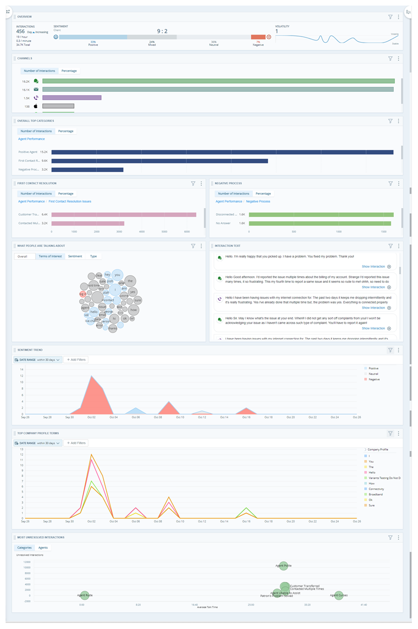
Overview Bar Widget
The Overview Bar widget gives you a general idea of sentiment trends throughout all interactions in the dataset. Interactions with negative sentiment may help you identify negative reasons for interactions. Positive sentiment may also help you identify ways agents handle interaction reasons effectively.
Channels Widget
The Channels widget shows the number of interactions by source. This is helpful to see what methods you use most often to communicate with customers. If there are a high number of interactions from a certain source, it may be helpful to look for channel-specific reasons for interactions.
Click any bar in the widget to see interaction details and transcripts for a channel. Review individual interactions to discover new insights.
Top Categories Widgets
The Top Categories widget shows the top categories for interactions in the dataset. By default, the widget displays categories for the category set applied to the dataset![]() Set of parsed interaction transcripts that spans a specific period of time and match your specified filter criteria.. You should have one widget that displays an overview of the category folders in the category set you selected. The second widget should display data for the category folder with the most interaction matches. The third widget should display data for the category folder with the second most interaction matches.
Set of parsed interaction transcripts that spans a specific period of time and match your specified filter criteria.. You should have one widget that displays an overview of the category folders in the category set you selected. The second widget should display data for the category folder with the most interaction matches. The third widget should display data for the category folder with the second most interaction matches.
Review the widget to see which categories have the most interactions. Each of these categories also has more specific subcategories that you can drill into. To investigate further, click the bar of any category and select Drill to [Category]. You can also view individual call recordings and transcripts if you click a bar and select Show Interactions.
Depending on what you discover you may want to filter the entire workspace by a particular category to see how that affects the data in the other workspace widgets. This might help you discover relationships between a category and things like sentiment![]() Overall mood or result of the interaction as determined by analysis of words, phrases, and context of the transcript., resolution status, or certain keywords and phrases. These discoveries might also lead you to adjust existing categories or create new ones.
Overall mood or result of the interaction as determined by analysis of words, phrases, and context of the transcript., resolution status, or certain keywords and phrases. These discoveries might also lead you to adjust existing categories or create new ones.
After you create or edit a category you must click Update Data on the Language Model page to apply the changes you've made. This triggers a reprocess for the current dataset. This can take several hours to complete. So, if you are also making changes to any other Settings, such as the company profile, complete all changes before you update. This allows you to include all updates in the same reprocess. If you make any additional changes within five minutes of clicking Update Data, they are also included in the reprocess. You can monitor the Reprocess Status in the bottom of the left navigation menu in Interaction Analytics (CXone).
An analyst at Classics Inc., reviews the Top Categories widgets. They look at the second widget, configured to display the Escalations category. They see that there are many interactions in the Management Mentions sub-category, so they read individual interaction transcripts. The analyst discovers that customers often ask to speak with management when agents don't have answers to their questions.
The analyst reviews the third widget, configured to display the Transactions category. They see several interactions for the Shipping Delays sub-category. They review transcripts to try and discover how agents handle these interactions.
Based on what the analyst saw in these categories, they decide to also investigate the Agent Performance Negative and Agent Performance Positive categories in the Overview Top Categories widget. They discover that many of the interactions in the Agent Not Knowledgeable category correlated to issues they found in the Escalations category. The analyst used the Agent Performance Positive category to compare what agents were doing well to address similar customer concerns.
Interaction Text Widget
The Interaction Text widget offers a quick view of the most recent interactions available in Interaction Analytics (CXone). The default view displays the first couple lines of the interaction plus a colored indicator that represents the sentiment![]() Overall mood or result of the interaction as determined by analysis of words, phrases, and context of the transcript. of the contact. You can expand the interaction to see more. This is helpful because the reason for an interaction is often mentioned in the first few lines.
Overall mood or result of the interaction as determined by analysis of words, phrases, and context of the transcript. of the contact. You can expand the interaction to see more. This is helpful because the reason for an interaction is often mentioned in the first few lines.
What People Are Talking About Widget
The What People Are Talking About widget displays a word cloud of the top 50 entities![]() Keyword or phrase defined in your company profile in Interaction Analytics (CXone). Related to an entity type. Can include variants. used most frequently in the interactions in the dataset. The word cloud is a simple way to discover new interaction reasons. Utilize the different view options to sort terms by Sentiment or Type.
Keyword or phrase defined in your company profile in Interaction Analytics (CXone). Related to an entity type. Can include variants. used most frequently in the interactions in the dataset. The word cloud is a simple way to discover new interaction reasons. Utilize the different view options to sort terms by Sentiment or Type.
As you review the data in other widgets throughout the workspace, you may discover that some entity types are of more interest to you than others. You can edit the Widget Options to change the terms that appear in the word cloud.
To hide irrelevant terms, click the term and then Hide. To take a closer look at individual interactions where certain words appear, click the term and then Show Interactions.
If you select Exclude instead of Hide, the phrase is added to the Entities workspace filter. This means that any interaction including the phrase is excluded from the widget as well as the workspace. Keep this in mind when you want to remove irrelevant phrases from the widget but keep the interactions where these entities are stated.
Consider hiding or ignoring certain common words such as it, this, that, is, I, you, and so on. These words may appear in helpful phrases like I loved the service or This is disappointing. However, more specific words will help you find better insights more quickly.
When you review terms in the word cloud, consider, "Does this word indicate a main reason for the interaction?" If so, make a note of that interaction ID. It’s important to document your findings to draw conclusions and make progress. Continue to evaluate other terms and interactions in a similar way, making notes of words, phrases, or interactions that stand out. You can also apply a Keywords and Phrases filter to see how specific terms from this widget are related to other data in the workspace. For example, you could filter the workspace by the term shipping. Then you could review the other widgets to see if negative sentiment or unresolved interactions containing that word are higher.
As you investigate, see if you notice any patterns or common interaction reasons. Investigate if a pattern is widespread enough to justify including it in a category. Before adding something to a category, consider the following:
-
Does the pattern occur in interactions that happen often, or is it focused on a specific event?
-
Does the frequency of a particular term or pattern relate to other patterns?
This process helps refine the underlying reason of interactions. It helps you look beyond the surface.
An analyst at Classics Inc., reviews the WPATA widget and notices there are large red bubbles for the words shipping, delays, package, and delivery. They add these terms to a Keywords and Phrases filter for the workspace and begin looking for patterns.
They look at the Sentiment Trend widget and realize that negative sentiment for these terms is higher on weekends. They look at the other widgets for other patterns like increased volume for a particular channel, company profile terms, or agents and categories with a lot of unresolved interactions.
They notice that the volume increases for the Self-Service category. They review individual interaction transcripts and see that customers frustrated with shipping issues also often complain about self-service issues on the Classics website. Since they notice that there are a substantial amount of customers that mention both issues, they create a category to investigate further. They add rules to a new category to include interactions that mention shipping issues as well as self-service issues on the Classics website. The analyst then reviews this new category to try to find a relationship between these patterns.
Sentiment Trend Widget
The Sentiment Trend widget allows you to drill down to individual contacts contributing to sentiment spikes. Some spikes are just increases in call volume, but the chart can show when the number of positive or negative calls fluctuates and allows you to investigate the cause.
At first glance, the Sentiment Trend widget may not provide much insight. Try filtering the widget or the workspace for a specific category to see the corresponding sentiment trends. After applying a filter, review spikes in sentiment. Spikes in negative sentiment in particular can highlight places to investigate. They can help you identify processes and behaviors that can be improved. Adjusting the date range to focus on periods when spikes occur can also be helpful.
For example, if the trend shows a noticeable spike in negative sentiment, filter the workspace to the date range where the spike occurs. This allows you to focus on just those interactions, so you can more easily identify the root cause. For example, looking at a date range of 14 days instead of 90 days may help you discover a pattern that occurs weekly on a specific day.
Top Company Profiles Widget
The Top Company Profile Terms widget shows you the company profile terms mentioned most often. This can help you identify topics that clients typically complain about or are pleased with. To hide irrelevant terms, click the term and then Hide. To take a closer look at individual interactions where certain words appear, click the term and then Show Interactions.
Most Unresolved Interactions Widget
The Most Unresolved Interactions widget displays the most common unresolved interactions in your contact center. The widget offers both a category view and an agent view. The chart displays categories by average talk time. The category view demonstrates what kinds of issues are often not resolved in a single interaction.
Unresolved interactions may help you discover reasons customers frequently interact with you. Review agents and categories with the most unresolved interactions to identify common topics. Click the individual bubbles in the chart to drill down further or review individual transcripts.
Measure and Track Progress
A goal-focused workspace is most valuable when your insights are used to drive change. Be sure to measure and track your progress on a regular basis. This helps you see how you are improving and helps you set appropriate goals.
A Classics, Inc. analyst used this interaction reason workspace to identify reasons behind escalations and customer loss. They used the workspace to discover ways they can improve processes and agent training to hopefully avoid these issues in the future. They discovered:
- Newer agents hired for the holiday season were less knowledgeable about procedures and policies.
- This caused an increase in negative customer sentiment and requests to talk to supervisors.
- Numerous customers mentioned frustration over shipping delays.
- Many customers who discussed shipping delays also mentioned self-service issues on the Classics website.
In response to what they found, Classics added new training resources for seasonal workers. They also worked on improvements to their shipping and scheduling process. They also added warnings to their website's checkout page, so customers would be more aware of the possibility of delays.
A month later, Classics ran the Category Statistics report to see their progress on their main interaction reasons. The report showed that the overall number of interactions for categories like Agent Not Knowledgeable, Shipping Delays, and Escalations all decreased.
Run the Analytics reports to view your progress. You could view data on a monthly basis or after a coaching session to track progress. Each time you run an Analytics report, you can compare that data to your baseline to measure your progress. Based on your improvements, you may also decide to use updated data to establish a new baseline to measure against. After you review insights from the workspace and Analytics reports, consider what milestones and supporting goals should come next to maintain a process of continuous improvement.
When you export report data, choose what metrics you want to include based on your organization's needs and interests. You can also decide if you want to view categories by team or agent. Aside from using these reports, you can also export data directly from workspace widgets. To export data from any widget, click more options > Export. When using this method, try to pick a time period that doesn’t have unusual circumstances. For example, a technical issue that caused a spike in interactions can skew your baseline performance data. You may need to look at a month or more of data to get an accurate baseline for your performance. Be sure to document specific issues you notice. This can help you connect events and explain data more easily.
Using Analytics reports is usually best for getting a more detailed view of your data. However, if you just want to focus on trends in volume by category, it can be helpful to export data directly from the Top Categories widget. To do this, export eight weeks of data, one week at a time. Combine each export so that you have eight sheets in the same Excel file that each show one week of data. Use this Excel sheet to calculate an average weekly volume of interactions per interaction reason.
Continue to monitor interaction reasons and compare fluctuation from your baseline. Be mindful of outlier interaction types and new trending interaction reasons. The more familiar you are with your baseline data, the easier it is to quickly spot fluctuations in trends.
As you monitor progress, review your business goals. Revisit your objectives to ensure you don’t overlook potential opportunities for impact.
Review and Optimize Categories
As you review your progress and establish new baselines, you may want to update existing categories or create new ones. Continue to use the workspace to identify emerging categories of interaction reasons. Once you’ve created relevant categories, reviewing category data by each metric of interest can reveal additional insights. ![]() Different from negative sentiment. Frustration cues show that a customer is upset rather than just discussing something negative., resolution, and silence time. This can help you know how to prioritize your improvement efforts.
Different from negative sentiment. Frustration cues show that a customer is upset rather than just discussing something negative., resolution, and silence time. This can help you know how to prioritize your improvement efforts.
The number of inbound interactions tends to fluctuate more than outbound interactions. So, categorizing interactions appropriately is key to understanding and quantifying shifts in interaction volume. Understanding the fluctuation of interactions reasons also helps you understand underlying issues that cause customers to contact you. Based on what you discover, you may want to break categories down further. For example, you could create categories for specific products. Or you could create categories for individual questions or concerns you receive often. This allows your analysis to be more granular as needed.
Your workspace will be most effective when you tie insights to business goals and strategies. It's also important to share insights with the people who have power to make change happen.