Options for Different Widget Types
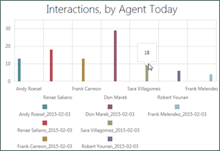
Metric widgets capture data from KPIs or metrics and present it in a variety of ways. You can use these widgets for a single value, or compare multiple values for two different metrics in a chart. Measures used in metrics are tagged with descriptive keywords (tags) in the system so you can find them.
For more information, see Metric Widgets.
Radial Gauge Widget Options
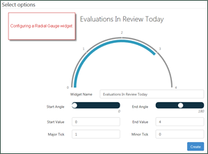
- Widget Name
- Title displayed for the widget on a dashboard. The name should describe what you configured for the metric. Not all widgets have a configurable title.
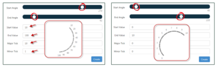
- Start Angle
- Defines the bottom range of the gauge. Dragging the slider changes the angle of the gauge.
- End Angle
- Defines the top range of the gauge. Dragging the slider changes the angle of the gauge.
- Start Value
- Defines the first numeric label on the gauge.
- End Value
- Defines the last numeric label on the gauge.
- Major Tick and Minor Tick
- These settings work together to determine the direction and shape of the gauge. The following images provide examples of how these settings can affect gauge appearance.
Linear Gauge Widget Options
- Widget Name
- Title displayed for the widget on a dashboard. The name should describe what you configured for the metric. Not all widgets have a configurable title.
- Start Value
- Defines the first numeric label on the gauge.
- End Value
- Defines the last numeric label on the gauge.
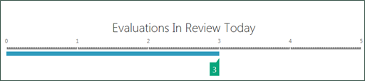
- Major Tick
- Defines the points on the gauge at which a value is displayed (in the preceding example, Major Tick is defined as 1).
- Minor Tick
- Defines incremental points at which the gauge may show tick marks but not a numeric value.
- Orientation
- Defines whether the gauge runs vertically or horizontally.
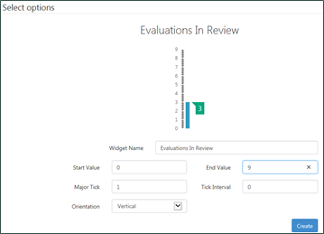
Chart Widget Options
- Widget Name
- Title displayed for the widget on a dashboard. The name should describe what you configured for the metric.
- X-Axis
- Defines the scale and labels used for the x-axis of the chart.
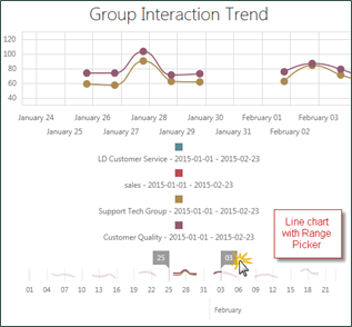
- Range Selector
- Allows you to select a checkbox that enables users viewing the widget to dynamically drill down from the dashboard to view all or a subset of the date range specified in the widget configuration.