Metric Widget Presentation Options
Metric widgets capture data from KPIs or metrics and present it in a variety of ways. You can use these widgets for a single value, or compare multiple values for two different metrics in a chart. Measures used in metrics are tagged with descriptive keywords (tags) in the system so you can find them.
For more information, see Metric Widgets.
The presentation options available for a metric widget vary based on whether the widget contains one value (single data-point) or a series of values (multiple data-points).
Single data-point widgets can be presented as either a gauge or an indicator. Gauges work best when presenting a metric that has a natural or expected range to it (such as, a quality score that may range from 0% to 100%). They can be configured to display differently if the metric drops below a specified value. Metrics without a predefined range are usually better suited to presentation as indicators.
Multiple data-point widgets usually display a single metric over time or display metric values for many agents or other key values. Multiple data-point widgets can incorporate graphical elements to enhance their usefulness. Line charts are well-suited to present data over time (such as days, weeks, months, and so on). Bar charts are helpful for comparing metrics across different agents, groups, skills or other key types.
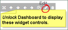
With appropriate permissions, you can edit widgets after they have been added to a dashboard. When you unlock any dashboard, controls appear at the top of each widget that allow you to edit, move, resize, copy or delete the widget.