Tips for Developing Effective Dashboards
NICE Uptivity Performance Management Dashboards make it easy to broadcast and share data and information in visually-rich and impactful ways across your contact center.
For more information, see Dashboards Overview.
Dashboard development is easier when you give some initial thought to what you want the workspace to become. For more information on the types of widgets you can use in dashboards, see Managing Dashboard Content. For more information on metrics, measures, and KPIs, see Understanding Measures, Metrics, and Keys.
The following tips will help you be more efficient in developing and designing dashboards to meet your organization’s needs.
- Before you begin, consider why you are building the dashboard and who your audience will be. Is the dashboard for you, or will you publish it for others to use?
- Studies show that people actually perform better when they know how and when they are being measured. For example, group dashboards can include statistical metrics that show people how they are performing, how they “measure up” to their group, and any other unique ways you measure success in your contact center.
- Does your audience need regular access to specific reports or lists? Consider adding the appropriate report widgets to the dashboard.
- Once you have specific KPIs in mind, consider how you might want to present them on the dashboard. It is good to be aware of your presentation options up front. Some designers find it helpful to make a rough mockup of the dashboard.
- After you have decided on potential KPIs and a basic layout, start building the dashboard in Uptivity Performance Management. The Widget Designer guides you through data metric selection, configuration, and presentation options.
- Remember that it is okay to experiment as you design. For example, you can create a metric widget and then decide you want to a different presentation style. To change the widget configuration, you simply edit the widget. At any time, you can change how information is presented by switching widgets and panels around for a different layout.
- You can capture any number in a gauge or indicator. These widgets display a single data point (such as a score, count, duration, or percentage) for a specific (or relative) point in time for a specific group, agent, or other key value. Gauges work best when presenting a metric that has a natural or expected range to it (such as, a quality score that may range from 0% to 100%). Metrics without a predefined range may be better suited to an indicator widget.
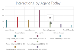
- You can use multiple data-point widgets to display a metric over time or to view metric values for many agents or other key values. Line charts are useful for presenting data over time (day, week, month, quarter, and so on). Bar charts can be used to compare metrics across different agents, groups, skills, and so forth.
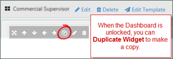
- To save time, you can copy (or clone) widgets (see Copying / Cloning a Widget).
Related Tasks
- Adding Panels
- Creating a New Dashboard from a Published Template
- Creating a New Dashboard Without a Template
- Customizing the Starter Dashboard
- Editing Dashboards